QUBIT Brand Guide
We Chose Quantum Sand, White, And Black To Create A Minimal, Modern, And Trustworthy Look That Reflects QUBIT's Futuristic And Accessible Mission. This Comprehensive Guide Ensures Consistent Brand Application Across All Touchpoints.
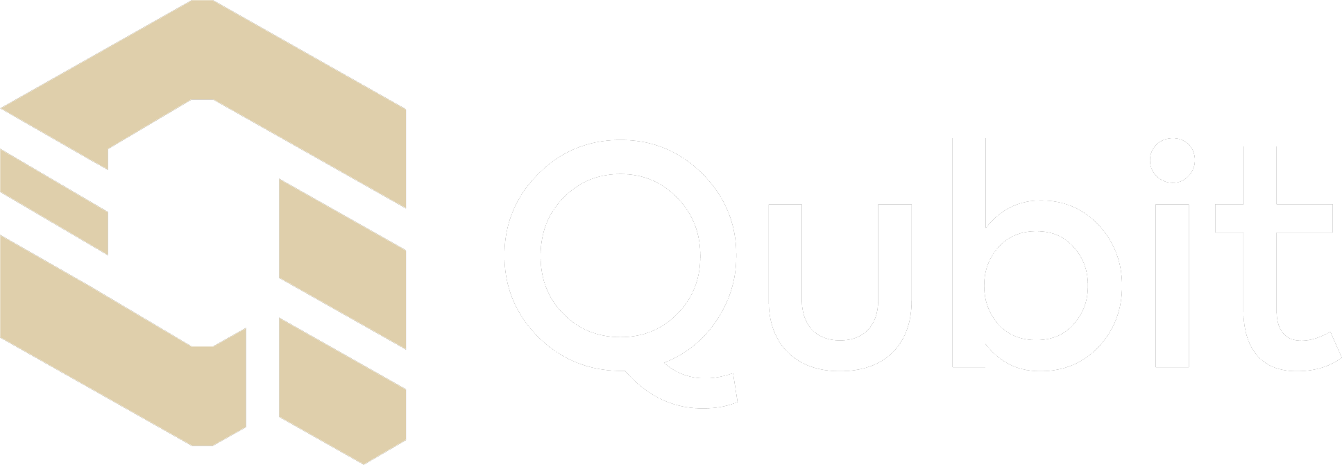
Our Logo
Choose The Appropriate Lockup Depending On Your Specific Application. When Sizing Or Scaling The Wordmark Or Lockups, Ensure A Legible Size At All Times. It Should Not Appear Subordinate To Any Other Partner Logos Or Lockups.
Stacked Lockup
Single-Line Lockup
Brand Palette
We Chose Quantum Sand, White, And Black To Create A Minimal, Modern, And Trustworthy Look That Reflects QUBIT's Futuristic And Accessible Mission.
Quantum Sand
Quantum Dust
Horizon White
Singularity Black
Palette In Use
Our Brand Palette Is Intentionally Minimal Yet Expressive, Designed To Reflect The Future-Facing Nature Of QUBIT.
Primary Typography
The Qubit Logo Features A Minimal, Geometric Monogram Of The Letter "Q," Symbolizing Innovation And Precision Through Clean Lines And Abstract Form.
Axiforma
Medium
Axiforma
Book
Hierarchy
The QUBIT Typography System Ensures Clarity And Visual Consistency. Big Headlines (Axiforma Bold, 60px) Command Attention In Key Sections, Sub-Headlines (Axiforma SemiBold, 30px) Enhance Structure And Flow, And Body Text (Axiforma Book, 15px) Maintains Readability Throughout.
Header 1
152px - Line height 165px
Header 2
96px - Line height 112px
Header 3
64px - Line height 75px
H4
33px - Line height 45px
H5
22px - Line height 30px
H6
15px - Line height 22px
Paragraph
15px - Line height 22px
Footer
11px - Line height 18px
Download Fonts
Download the Axiforma font family used throughout the QUBIT brand. Available in multiple weights for consistent typography across all applications.
Axiforma Medium
For headlines and emphasis
Axiforma Regular
For body text and general use
Axiforma Light
For subtle text and captions
Big Headlines (Axiforma Bold, 60px) Command Attention In Key Sections
Sub-Headlines (Axiforma SemiBold, 30px) Enhance Structure And Flow
Body Text (Axiforma Book, 15px) Maintains Readability Throughout
Clear Space
Our Logo Should Always Be Given Enough Space Around It For It To Be Legible And Prominent. Our Safe Zone Is Based On The Height Of The 'Q' Character, And There Should Never Be Any Design Elements, Type, Or Iconography Within This Space To Avoid Crowding The Logo.
Horizontal Logo
The QUBIT Logo Can Be Strategically Positioned In The Top Left, Top Right, Bottom Left, Or Bottom Right Corners Of Various Layouts. This Flexible Placement System Ensures Visual Consistency Across A Wide Range Of Applications.
To Maintain A Strong Visual Hierarchy And Balanced Design, Avoid Placing The Logo At The Centre. Corner Positioning Supports A Clean, Structured Composition And Allows For Effective Use Of Negative Space.
Stacked Logo
This Reflects QUBIT's Design Philosophy: Modern, Precise, And Purpose Driven. Ensuring The Logo Enhances Rather Than Distracts From The Content.
From Technical Documents And Presentations To Digital Platforms And Print Materials, maintaining proper clear space is essential for brand recognition and visual impact.
Usage Guidelines
To Preserve The Integrity Of The Qubit Logo, It Must Always Be Used With Care And Precision. Always Double Check To Ensure The Logo Remains Clear, Proportional, And Uncompromised.
Minimum Size
To Ensure The Logotypes Visibility Never Use It In Smaller Sizes Than Recommended Here.
Logo Placement
The QUBIT Logo Can Be Strategically Positioned In Corners. Avoid Placing The Logo At The Centre To Maintain Visual Hierarchy And Balanced Design.
Partner Logo
To Maintain Visual Clarity And Brand Integrity, Always Leave Clear Space Around The Qubit Logo. We Define The Clear Space Using The Letter "Q" From The Qubit Typeface.
Do's and Don'ts
To Preserve The Integrity Of The Qubit Logo, It Must Always Be Used With Care And Precision. While Some Misuse Cases May Seem Obvious, Errors Can Easily Occur During Resizing, Scaling, Or File Handling. Always Double Check To Ensure The Logo Remains Clear, Proportional, And Uncompromised In Every Application.
✓ Correct Way To Use
Black on Quantum Sand
Quantum Sand on Black
Black on White
Black on Quantum Dust
✓ Use approved color combinations
✓ Maintain proper proportions
✓ Ensure adequate clear space
✓ Keep logo legible at all sizes
✗ Incorrect Way To Use
Don't Change Aspect Ratio
Don't Skew
Don't Rotate
Don't Crop
Don't Warp
Don't Alter Weight
✗ Don't stretch or distort
✗ Don't rotate or skew
✗ Don't crop or alter
✗ Don't use unauthorized colors
Download Brand Assets
Get Access To All Logo Variations, Color Palettes, Typography Guidelines, And Brand Standards. Perfect For Partners, Developers, And Collaborators Who Want To Maintain Brand Consistency.
Qubit Icon
Standalone icon in PNG format
Qubit Wordmark
Full wordmark logo in PNG format
Complete Brand Package
Download the complete QUBIT brand package including all logo variations, color swatches, typography files, and usage guidelines in multiple formats (PNG, SVG, PDF).
Package includes:
- Logo files in PNG, SVG, and EPS formats
- Color palette swatches (ASE, ACO, SCSS)
- Axiforma font files (TTF, WOFF, WOFF2)
- Brand guidelines PDF
- Usage examples and templates